


The Brand
In this section, we delve into the essence of our brand, the values and principles that define who we are and how we present ourselves to the world. Discover the audience we connect with, the position we hold in the market, and the personality that sets us apart.
Brand Guidelines Overview
Our brand guidelines are designed to ensure consistency and coherence in our branding efforts across all channels and touchpoints. By following these guidelines, our team can maintain the integrity of our brand identity and effectively communicate our values and personality to our audience.
These guidelines cover everything from our logo usage and color palette to our tone of voice and imagery guidelines. They serve as a comprehensive resource for anyone involved in creating content or representing Dreaming Tree Initiative in any capacity.
Brand Positioning
Filler text here that we need to tadd
Tone Of Voice
Filler text here that we need to tadd
Logo
In this section you'll discover the backstory of our logo's creation, the symbolism embedded in its design, and the guidelines ensuring its consistent and effective usage across platforms.
The logo
Filler text here that we need to tadd
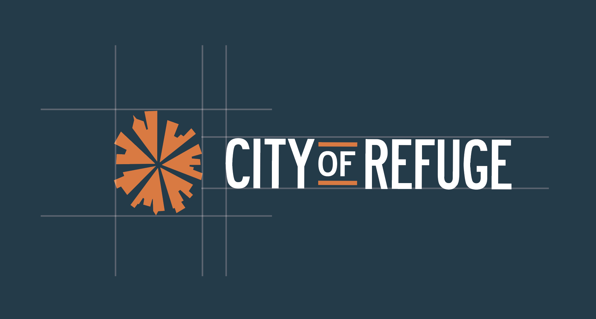
Construction and safe space
Filler text here that we need to tadd
Construction

The logo was carefully crafted and spaced to create clarity and consistency.
Safe Space

By maintaining a designated safe space, the logo is given room to breathe, ensuring that it remains visually distinct and easily recognizable in any context.
Logo usage
The logo may be used in several ways and it different color variants. The flexibility of the logo system allows for easy usage and impact across all platforms.
Primary Logo

The primary logo used when possible. (i.e. flyers, guides, merch, etc.)
Secondary Logo

The secondary logo used in tighter spaces. (i.e. websites, email signatures, business cards etc.)
Logo Symbol

The logo symbol can be used in any brand color.
Typography
Typography is one of the cornerstones of our visual identity. A good pairing of fonts and a strong hierarchy ensure maximal visual impact. Beneath you will find information about the typefaces we use.
Primary Typeface
Filler text here that we need to tadd
Secondary Typeface
Filler text here that we need to tadd
Colors
The colors are another essential part of of our visual identity across all platforms. In the following section you will find the primary colors as well as an extended palleted to be used for web.
Brand Colors
The primary color palette consists of 6 main brand colors and two gradients. These colors are used in our logos, on flyers and on social media etc. If needed for contrast, different hues of these colors are also permitted.

Illustrations
Supporting graphic elements and patterns can be used to add details and attract attention.
Patterns
Our pattern comes in different colorways.
Primary Colorway
The pattern can be used as a background graphic, an overlay etc.
Secondary Colorway
The pattern can be used as a background graphic, an overlay etc.
Downloads
In this section you will find several assets to download. Please use caution when sharing these assets.
Logo
All Logo Variations
Primary Logo
Secondary Logo
All Alternate Logo Variations
Logo Symbol
Logo Badge
Typography
Primary Typeface
Secondary Typeface
Illustrations
All Illustrations & Patterns
Brand Assets
Patterns
Offerings
Steps
Charts